
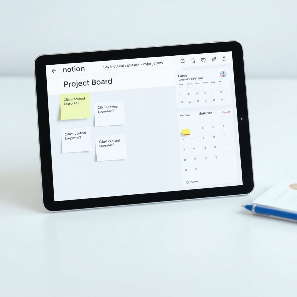
You’ve done everything right. You found a template that looks amazing, you duplicated it into your workspace, and you even customized it a bit. But two weeks later, you’re back to using sticky notes and a messy folder system.
Sound familiar? You’re not alone. I talk to makers every day who tell me the same thing: they buy templates, they try them, but they never stick. The problem isn’t your productivity — it’s the template itself.
Most templates fail for three reasons: they’re too complex, too rigid, or too vague. Let me break down each one and show you how to fix it.
## The Complexity Trap
Some templates look like the cockpit of a spaceship. They have dozens of databases, hundreds of properties, and formulas that make your head spin. On paper, it seems powerful. In practice, it’s overwhelming.
When you open a template like that, you don’t know where to click. You’re not sure what to fill in first. The cognitive load is so high that you give up before you even start.
Fix: Strip it down to the minimum. Ask yourself: what is the one thing this template should help me do? Then remove everything that doesn’t serve that purpose. A good template should feel like a clear path, not a maze.
For example, in my Client Projects template, I only have three databases: Projects, Tasks, and Contacts. That’s it. Each one has just the essential properties. You can add more, but you start with a clean slate.
## The Rigidity Problem
On the other hand, some templates are so rigid that they force you into a workflow that doesn’t match your brain. You have to use their exact status names, their exact categories, their exact way of doing things. If you deviate, the whole system falls apart.
That’s a recipe for failure because no two people work the same way. I might call a status ‘In Progress’, you might call it ‘Doing’. The template should allow for that flexibility.
Fix: Build templates with flexibility in mind. Use select options that are easy to change, but don’t make the entire structure dependent on them. For example, instead of hard-coding a specific status list, I create a simple status property with ‘Not Started’, ‘In Progress’, ‘Done’ and let users add their own.
Another way to build flexibility is with views. Instead of giving users one monolithic dashboard, provide multiple views that they can switch between: a list, a board, a calendar. Let them choose the one that feels natural.
## The Vagueness Trap
Finally, some templates are so minimal that they don’t provide any guidance. They’re just a blank page with a few headings. That’s not a template — that’s a text document.
A good template should give you structure and prompts. It should tell you what to put where, and why. It should include examples and placeholders that you can replace with your own content.
Fix: Add helpful context. Every section should have a brief description of its purpose. Every property should have a tooltip or an example. The user should never wonder ‘What goes here?’
In my Content OS template, I include a sample article with notes. This shows users exactly how to use the template, and they can delete it once they’ve got the hang of it.
## The Real Fix: Test Your Templates
If you’re building templates for yourself or for others, the best way to avoid these pitfalls is to test them. Use the template for a week. Try to break it. Ask someone else to use it. You’ll quickly see where the friction points are.
I’ve been iterating on my templates for years, and I still find ways to improve them. That’s why every template in my store comes with lifetime updates — I’m always refining based on real feedback.
If you’re tired of templates that don’t work, give mine a try. They’re designed to be simple, flexible, and helpful — not bloated and complicated. Download one and see for yourself.